Thursday, August 26, 2010

skeletal hand

It doesn't look like much but the hand required a lot of modelling - something which none of my earlier posts never had. This also served as a small brush-up on texturing. Like the image of the candle floating on water, subsurf scattering worked miracles on the finale image.

The file for the mesh plus the materials is available. It is high-resolution and anatomically correct up to some degree. Not only does it include the hand it includes the radius and ulna, two bones that make up the forearm. Feel free to alter it and render it in your image.

To access it, click on the link provided

http://cid-ea40627868c69dba.office.live.com/browse.aspx/.Public?lc.=4105 and download the .blend file labeled as 'skeletal hand.' In some cases, because the file is 4.8 mb, it might prove to big. So, I will be uploading a zipped or compressed version shortly.


Tuesday, March 16, 2010

Diamonds


With my experience, I quickly learned that Blender's internal renderer isn't the type of renderer that I really wanted. It was too slow, often freezed my PC, and its materials tab was difficult to grasp. Also, it wasn't able to close until it finished the rendering process. I spent some time researching for 3rd party programs and found a couple. There were quite a few available: Vray, Luxrender, Yafaray, Indigo, and Maxwell Render. Looking for something not complex, I switched to Yafaray. Unlike blender's renderer, this supported caustics, an optical phenomena I needed for 'Diamonds.'

For basics, this site offers a diversity of tutorials for lighting, camera settings, render settings etc. :http://yafaray.org/documentation/userguide


For properly creating a proper environment: http://www.yafaray.org/documentation/tutorials/studiolighting


For a full discription explaining different methods of rendering yafaray support:http://www.yafaray.org/documentation/userguide/lightingmethods


Finally, I was able to finish the scene during the March Break. Through this, I learned of dispersion, absorbsion, photon mapping, pathtracing, and caustics. For 'Diamonds,' I used photon mapping as the primary rendering method.


A option called Raydepth really defined the diamond-like look. It defined the number of light bounces inside the mesh. A good number is 8 to 11. Anything below that makes the diamond look black because, I'm guessing, it absorbs the lighting without letting it bounce off.


Another effect called dispersion is also pretty amazing. From what I understood, it let the light that bounces off refract into individual wavelenghts.


An example of depersion...
Clay render is an extremly useful option available in yafaray. It renders the image without any materials. It is useful for testing out any meshes to see how it turns out.
Here is the same image with a darker background and a lower gamma. For those who don't know, gamma increases the brightness in a scene.


The diamond wasn't difficult to put together. The mesh was modeled on a brilliant cut, a unique type of diamond shape. The only risk was in working with Yafaray. However, Yafaray was not as hard as I expected. Most importantly, Yafaray was accurate, quick and easy.

Thursday, February 18, 2010

Candle


This a more of a smaller project of mine. Because of a long break I had from Blender, this was just to refresh my memory. The big thing I learned from this was subsurface scattering. Because of the physics of light waves, The color reflected back is affected by the object it comes in contact to. This, I think, is a correct and brief discription of what it does.


Below, is an image without subsurface scattering. Note that this has a subsurface scattering of .1. Thus, the area the color of the light is mixed with the color of the object is smaller. Anything higher creates a warm blurry glow. For this, I used an area of 1 to achieve the wax material

Another major tool I learned was the wave modifier. The wave modifier lets you create simple waves, ripples, wakes without using the memory-consuming physics engine. It allows decent effects combined with a quick understanding for its capability. All in all, after this break, I plan to exlore more complex and attractive 'projects.'


Sunday, November 8, 2009

Sweet Physics

Designing a fluid in blender is extremely easy to learn but much harder to perfect. Considering I learned the particle system in 4 days in time for my dad's birthday, I feel that I did a good job. On the other hand, I have still a long way to go. One of the problems I was faced with was making the fluid's material less clay-like. It was resolved when I changed the wineglass's material to Ztransparency from Raytransparency. Of course, I had to sacrifice some quality.
Building the liquid needed many trial-and-error's to perfect. It had to seem like a splash, like seconds before, someone poured wine. It had to look natural though. A tip for beginners, put the final resolution at 50 for a reasonable-qualtiy, fast render. Don't forget to reduce the frames taken from the default 250 to a petit 30. To achieve the splash, I learned that the height one drops the liquid can affect the splash. When I was happy with my design, I rendered it at a resolution of 130 and smoothed it. The result was a very detailed liquid render.
As you should notice, the materials aren't very exact and doesn't have the transparency that water/wine normally has. However, I couldn't make it transparent and still continue to experiment with it. Maybe, I should render it with an external renderer such as yafaray and luxrender.

November 6th
November 7th


Sunday, August 30, 2009

lightbulbs

Not only was this a small project of mine, I also used this to experiment with blender's lighting and glass materials. Creating the lightbulb head needed glass that was thin and clear and appeared fragile. Making the clear and realistic glass was easy but the thinness was challenging. http://wiki.blender.org/index.php/Doc:Tutorials/Materials/Clear_Glass had very clear instructions on how to build hollow glass.


I have also worked with textures. You might not notice but the bottom of the lightbulb is textured as brushed metal. http://www.tutorialhero.com/click-39868-brushed_metal_in_blender.php gives you very understandble instructions for brushed metal.


The lighting was another important factor. After playing with halos, suns, spots and hemis, I choose lamps. I raised the energy for the lamps very high and enabled filtering for the glasses.

I have done many testing with lightbulbs and have discovered many amazing features. Included here is the render without trashadow enabled. Notice that the glass blocks light from coming through, thus making parts that should be lit otherwise not.


Now here is the finished result with trashadow and a brighter colour. Here, you can clearly see the trashadow enabling rays of light to travel through glass or anyother transparent object. There are several thing I want to improve. I want to apply the light so that the the viewer can see the light spreading through the black void. I also want to use rows and rows of duplicates of lightbulbs behind the original lit one so as to test lighting and refraction of many objects. However, my pc blacks out if I add any more than 6 lightbulbs

I am leaving this project as it is for now but will continue later. Please comment if you have any suggestions, reviews and ideas.

Thursday, August 6, 2009

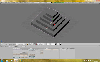
Building a Aztec Pyramid - Part 1

The Aztec pyramid is a marvel of the ancient civilization that once lived in Mexico. Even to this day, the pyramids challenges our own modern architecture. However, 3d programs can recreate one of the best known wonder in little over a hour. Here are some pictures to give you an initial idea of what you're designing.


  1. When you open Blender, you should be staring at the top of the default cube. We will use the cube as the base upon which the pyramid is built on. Select and scale the whole cube by 20 units (S - 20). It would be best to now switch to the side view (numpad #3) since the side view is best for editing heights. The base is still too thick so scale the cube in the global Z direction into .12 of its original size (S-Z-.12). Tip: you can drag the base to the desired proportions or you can type in a numerical value. If you want an exact measurement, dragging would take too long. Instead, you could just type it in.


  2. The base is into the ground level so move it upwards by 2.5 units so that it sits on the ground level (T-Grab/Move-Z-2.5). This isn't necessary because the ground level won't be seen when rendering but ,when I am editing, it looks natural for the structure to be on the ground level.


  3. I see these proportions as the ideal base but you're free to change it as you want. Tab into EDIT mode and change the default vertex select mode to face select mode(Ctrl-Tab-3). With this, pick the top face. You might want to change your view to top view for this but remember to change it back when you're done.


  4. Extrude the top face(E) and press enter but take care NOT TO MOVE IT. Left-click to confirm the amount of extrusion. Scale the extruded part (S) by .8 or .75. Now extrude again by 4.5 units in the z direction.


  5. Repeat step 4 approximately 5 times and exit edit mode. Soon, you will have something that looks like an Aztec pyramid.

Friday, July 31, 2009

The Frozen Army


Building the chess set took around 4 hours of my time but the end product was definitely worth it. Making the chess pieces were straightforward and simple. All the pieces were bezier curves with the exception of the knight. Making the knight took a bit longer than the rest. I had to design a curve to look like the face of a horse, then closed it, extruded and beveled until it pretty much represented the knight in a chess set. To add more detail, I turned the whole curve into a mesh and subsurfed it 2 times. In order to make the pieces look like crystal, I made a few modifications to the material sample given at this site.


I resembled the chess board to chrome with a slightly higher reflectivity. The lighting was 1 lamp placed on the backside of each army and one with a lower energy in the middle of both. The rendering was higher than I expected and clocked 9 minutes after few modifications. On the other hand, the image was very well done. The Frozen Army isn't perfect though, I realize that I needed to give a wider angle, more energy into the lighting, create a difference between the two sides and decrease the reflectivity of the board. Knowing this, my future models would be much much better.